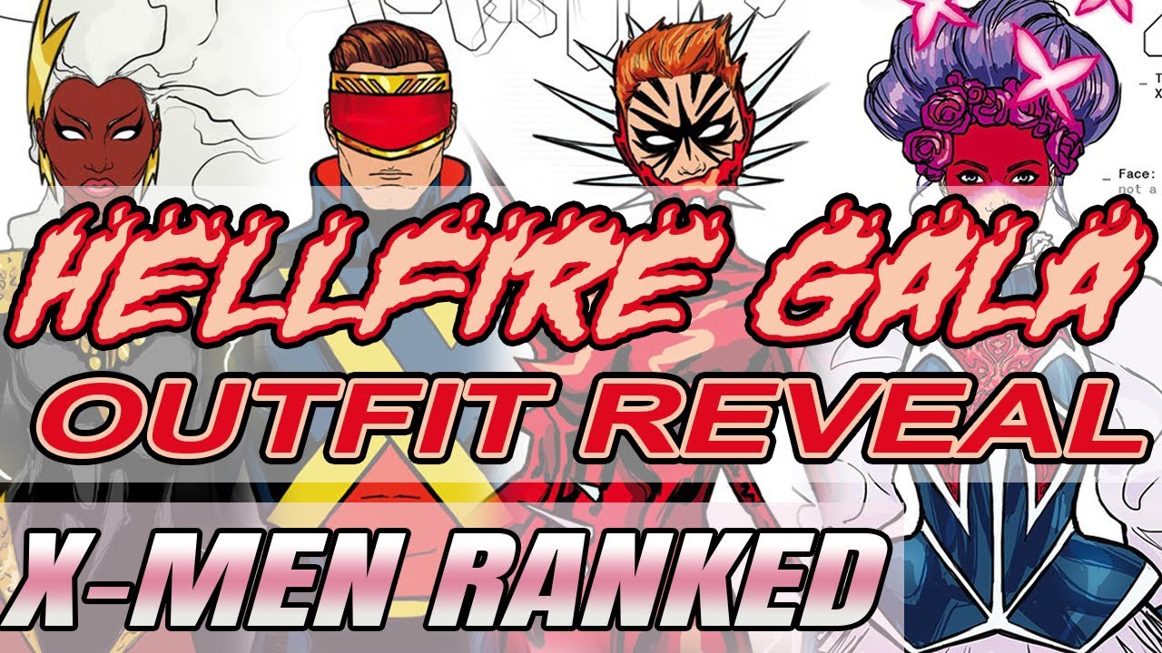
Marvel’s Hellfire Gala event is really taking the X-Men’s fashion world by ‘storm’!
Marvel has released more official Hellfire Gala looks for the X-Men. This time they’ve pretty much done a full mutant roll call, and have rounded up all the various teams into groups to showcase what everyone will look like as an ensemble cast.
The Hellfire Gala is really being sold as the big event of 2021 for the X-Universe, though what’s going to happen during it is as good as anybody’s guess. Since the results of the X-Men election have been tallied and the new X-Men team has already been announced, there’s nothing really driving this Gala forward anymore from a fan anticipation standpoint, beyond all of these glamorous looks.
The Gala is meant to be the first big party between the mutant nation of Krakoa and its human allies, and supposedly it’s going to shake a lot of things up for the merry mutants with a big announcement, though in what regard I really don’t know.
Personally, I am expecting some drama to come from Mystique, and perhaps even Destiny from beyond the grave. A friend of mine hypothesized that the X-Men might branch out and take over Mars (hence the comic title Planet-Sized X-Men), but we’ll have to wait until June to find out any of these guesses for sure.
In any case, a highlight of this event from a fan-perspective has most definitely been the fashion, and Marvel has really been delivering in terms of fan-service.
10. X-Force
X-Force has by far the least exciting looks out of all the Hellfire Gala designs. I’m 50/50 on a lot of the team design reveals overall, but at least they’ve tried to be unique or outrageous or have some semblance of personality for the most part, and I can’t say that anything here on X-Force has even remotely put any effort forward.
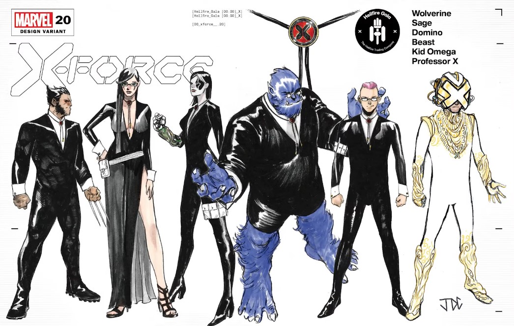
According to Marvel, the X-Force team won’t even be officially attending the gala as guests, but instead they’ll be working the doors and providing security detail. With that in mind, then sure, I get understand this team them. Their fashion moments here have to be pretty understated and stealthy so that they can keep an eye out for any hooliganism.
It’s just such a shame because I really feel like some of these characters could have really stolen the show at the Gala. I could totally picture Wolverine, Sage, Domino, and even Quentin having some really stunning outfits.
There was some great Gala Fan Art that was designed of Wolverine & Quentin that I highlighted in my Top 20 Hellfire Gala Fan Art Design list, and it sucks now looking at these official boring costumes after seeing that exciting, imaginative stuff that was brewed up from the fans that will now never be realized.
I will say that at the very least this team look is one of the most cohesive of the bunch. If the theme was bodyguard then they nailed the assignment. But I think it’s overall a bit of a cop-out and I’m just really sad that none of these characters will have any wow-moments on the green carpet.
I really liked the bolo necktie on Wolverine, and I thought it was a really smart addition because it harkens back to his western-style taste in clothing. I actually thought that if he had been wearing like a sleek black cowboy hat here then it might’ve added a touch of the personality to the outfit, but then I saw that everybody was wearing the bolo necktie, and I started to hate it. It made a lot of sense to me when I saw it on Wolverine, but I don’t get it on anybody else. The bolo necktie doesn’t really vibe with them or their styles, and I think it cheapens Wolverine’s look by having EVERYONE wear it.
My favorite look on this team is actually Xavier’s look. And that’s not even just because his is the only one that looks unique here, I actually do like what Xavier’s wearing, which I think might be the minority opinion out there. Even if Xavier was stacked up here against a bunch of other characters wearing cool clothes, my eye would still gravitate toward him and I’d still be like “huh. Interesting”.
His outfit is a reference to his old field-gear that he wore with the team after the Secret War when he accompanied the X-Men on a few missions like fighting a dragon in Tokyo and rescuing Rachel from Selene, and I actually really enjoyed that campy little unitard.
This is a very blinged out version of that uniform, or at least that’s what I’m seeing. It looks like his threads will have some sort of psionic glow to them, and it looks like he’s using some sort of Krakoan flora for his boots and sleeves. I really like all of those ideas together, so in a final rendered version of this art, I think it could look quite radiant.
When I look at what he’s wearing and I consider what he’s trying to tell us through his clothes, I actually get like… ‘Mutant Messiah’ vibes, which I think is kind of a ballsy move for him. He’s definitely charged the way for Mutant rights and is an architect of the new reality that everyone’s living on Krakoa, but he’s also a guy who’s done some shady dealings, and he still is doing shady stuff today like banishing people to the pit and refusing to resurrect precogs, so I certainly wouldn’t classify him as my Mutant Messiah, and I wonder if there are any others out there who would feel the same way…(Mystique)
Xavier on the X-Force team is a SUPER interesting concept to me, so I do hope that he’s joining it. Him being part of the black-ops mutant-militia is extremely backwards from the idealized version of how we know Xavier’s dream, but times have changed since he first dreamt that dream, so being on X-Force could be the modern-day answer of how Xavier hopes to achieve things.
9. Excalibur
I wasn’t overly thrilled by what I saw with Excalibur’s team look either. It all just looked like big, flowing, high-fantasy garments, which as I say it, I realize that is very much the kind of book Excalibur is trying to be. I think they get another A plus in terms of team theme cohesion, but I just didn’t think the execution really pushed these clothes to elevate them to the next level. They just look like fabrics that have been draped over these characters’ bodies, but they don’t look like they are necessarily being worn.
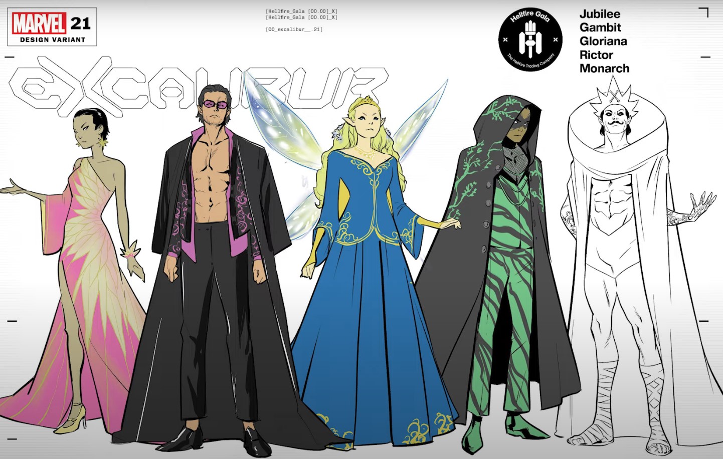
I think the most interesting one here is Jamie Braddock’s, because at least he has some interesting and unique shaping in that high-collared cape-robe thing he’s wearing. Is his outfit all white or is he just left uncolored? I can’t really tell to be honest, but I kind of like it as an all-white design. I can’t say that it really evokes Jamie for me though, because Jamie is normally so wild and crazy that I’d expect a splash of color everywhere, but maybe he’s turned over a new more subdued personality since his Monarchy began. It’s obviously a reference to his old “costume” of just wearing a tidy pair of white briefs, but still, some color might have been nice.
I really like Gambit’s outfit, too. It’s dripping with sex appeal, which is exactly the embodiment of who Gambit is as a character, but it’s also a little classy. As a Thief he has to be able to blend in, but still have a bit of edge, and I think that’s exactly what this outfit has.
I wanted a lot more out of Jubilee and Meggan’s looks. They both look like they are missing things, like more jewelry or accentuation or something. Jubilee especially looks like she needs a fascinator or some sort of statement piece on her exposed shoulder. Meggan’s is really going for that Fairy Queen Fantasy, but I wish the embroidery was more pronounced or that they juszed the bottom-half of her gown up a bit with some more color, because it looks like she’s just being swallowed in a sea of blue.
I do NOT like Rictor’s look, and I think it pushes him in way too deep into all of this Druid nonsense. This looks does totally like a druid, so mission accomplished there, but I hardly see any element of Rictor here. The only aspect I really like of it is the briefest glimpse of a mesh shirt, which is like, to me, Rictor trying to break free of this direction the creators have his character going in.
Even though not all of the looks nail it for me, if this line-up is indicative of the new Excalibur team, I am honestly all for it. Meggan joining the ranks and filling the hole left by the departing Rogue is a totally welcomed idea, and I think the more they get the Braddock extended family in here, and let the actual X-characters go off and do better things with their time, then the more fulfilling this book will actually become.
8. X-Factor
Oof, these looks are all over the place. I guess we can’t expect every team to have a theme, right? But after the cohesiveness of the previous teams, this does just feel like a bit of a sloppy mess.
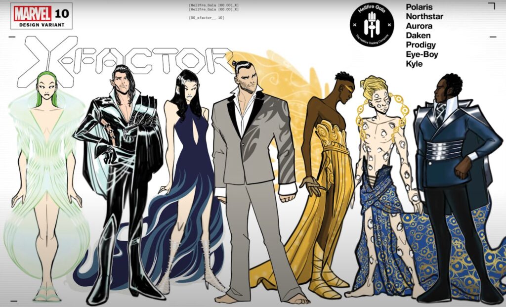
The absence of a team theme aside though, I don’t really think a lot of these designs work based on their own merit alone. Daken is boring me to tears with his simple grey suit. He’s way more of a hip, cutting edge character than this, and I’m not buying for one second that he wouldn’t be wearing something a bit trendier than this. A fun tattoo design and a loosened collar button isn’t really making up for a lack of overall personality.
I don’t understand Prodigy’s outfit at all from a character perspective. I’m all for male characters wearing dresses or however they want to express themselves, but I really don’t understand these wings. As far as I know, this isn’t a reference to his powers or anything, so it’s feeling wayyy out of left field for me and I actually think it does him a total disservice. I would much rather him have worn something more indicative of who he is as a character versus something that was slapped on him as a potential queer stereotype. The color looks really great on him though, and the dress kind of looks Grecian so if it’s a reference to the Muses from Hercules, then I get it, but I’m gonna need to have that confirmed.
And I also think Polaris’ outfit is pretty boring. I really enjoyed the supposed ‘psionic glow’ from Xavier’s outfit, but this green magnetic one just makes her look kind of alien to me. It’s like she’s that lady from Mars Attacks or someone from the Jetsons. I think the cut of the dress is cool and it’s got a really interesting shape, but I wish it had more color patterns or something, because it’s all just blending together to me and I can’t differentiate between any of the details within it, which is a shame, because I think the details are actually what makes the dress more interesting than it just being a sleeping bag that’s floating around her body.
Kyle’s look is ok. I am not a big fan of Kyle to begin with, and I wish he and Northstar would break up so that Jean-Paul can go back to living his best life, but I can see why it’s more important to have two gay men married in comics than it is to appease my meagre plot dissatisfactions. I just think Kyle is a naggy and boring character, and his outfit kind of looks that way to me too, so I can’t say it isn’t representative of him as a character!
My top picks for X-Factor are definitely Aurora, Eye Boy, and Northstar, but only barely Northstar. He’s definitely getting in touch with his dom side in this look, and I can totally appreciate that of him, but something about it is a little off-putting, and I think it’s that exposed side. It just feels unnecessary and a bit try-hard. Everything else about the outfit I really enjoy, and it looks like it would be really squeaky, which I also enjoy.
Aurora’s looks super majestic, and even though I thought it was a little boring in the top-half, I really, REALLY like the way the entire bottom-half just flows like millicent in the wind. I can totally see how it would flap along her legs while she’s flying, and I think she would kind of look like a sexy Ursula the Sea Witch, but in the skies.
Eye Boy’s design is an interesting one. It’s definitely not the typical silhouette that we are getting from a lot of the guys, and I think his is an example of an atypical design executed really well. I totally see why this works for his character. Eyes are obviously his motif, and not only is he going pretty naked and exposing all of the eyes that are already part of his body (ie “the naked eye”), but the design on his fabric and on the laurel-y collar around his neck are also reminiscent of eyes.
I think Eye Boy’s design succeeds where Prodigy’s fails. For Prodigy, none of his outfit tells me anything about who he is, unless it’s a reference that I’m just not getting, but for Eye Boy, one look at this and I totally get him. I think it’s a brave choice for him, too, as he’s usually pretty covered up, but if he’s ever going to make this statement, then why not make it at the Hellfire Gala!
7. Way of X
I was a little disappointed with some of these designs, and Dazzler’s in particular. Dazzler is a character for whom the Hellfire Gala just seems like it would be the perfect time to really pull out some of her old pop star routine and deliver a showstopping number on the red carpet. It certainly goes with her character to do something like that, and in all likelihood it would probably be something perfectly campy because that’s just the kind of career Dazzler ended up having.
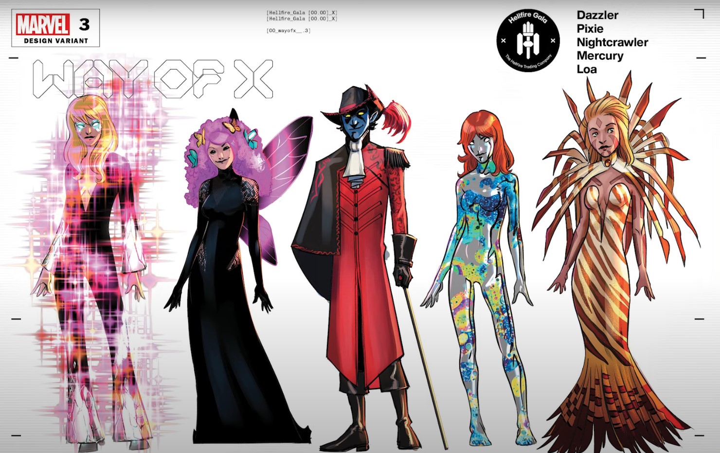
Dazzler’s look in this design kind of underwhelms me, though. Her being surrounded in light is totally campy, so that’s great, but it feels like the light is being used in a way that’s just an excuse to not actually make anything great for her to wear underneath it. In my opinion, the powers of these characters should never be the main attraction or focus of the garments that they’re wearing, but should instead be used as a way to augment the look or to help take it to an extra-elevated place.
Just like how the characters aren’t defined by their powers, the Gala clothes should not be defined by them either. Take away Dazzler’s dazzle and what is she really wearing here? Like a black pantsuit with a plunging neckline and some silver hems? It’s just not something a pop star would wear to a gala, and this idea misses the mark for me.
I do like Loa’s look, even though it’s pretty on-the-nose referencing a Lionfish, which in turn is referencing her, like, aquatic habits and fascination with water – but I think the designed it in a really elegant way that looks great on her.
Mercury’s look, if I can even call it that, feels totally lazy to me. Like, is this even a design? It’s just her body with some thermal colors on it, as if she’s a mood ring or something. I think it totally does her dirty compared to the effort that was put into a lot of other characters.
Pixie’s outfit I actually do really enjoy, and I’m really happy she’s embracing her dark side here. Pixie is only ever interesting to me when she’s missing part of her soul, and it feels like that’s what this black dress is supposed to be referencing, so I really like it. I find her bubbly personality really, really annoying, so the more I see her tortured by her dark side, the more compelling of a character she becomes for me, and this look seems like it’s doing a good job of playing with those two competing aspects of her by mixing the dark black with the hot pink. It also looks very grown up for her, and I am all about these kids growing up.
Nightcrawler’s outfit I’m 50/50 on. Going pirate was the safe and predictable route here, and that’s not a bad thing, and I think he looks sleek, but it feels like they just covered him in this long red jacket so as to get out of doing any intricate designing on him. Pirates are people who like bounty and treasure and gold, and they wear things that set them apart from others by flaunting themselves and the detail-work that’s in their garments. There’s a primadonna-ness to Pirate fashion, so for Nightcrawler to just wear a long jacket really feels like a slap in the face to all the Captain Hooks and Jack Sparrows who have come before.
I think this is a fun team as a whole, even if their looks or kind of all over the place, and with the addition of Dazzler to this book, I think it’s about to get a lot more exciting.
6. Marauders
Can I first say how much I am SO DOWN with this cast? With Storm leaving the team, there will be a huge void to fill, and I love the idea of Banshee stepping up to fill. Do I think he can scratch the itch left by Storm? Probably not, but for finishing second in the X-Men election, I’m glad that he’s being given the chance to at least join a team, if not the main one.
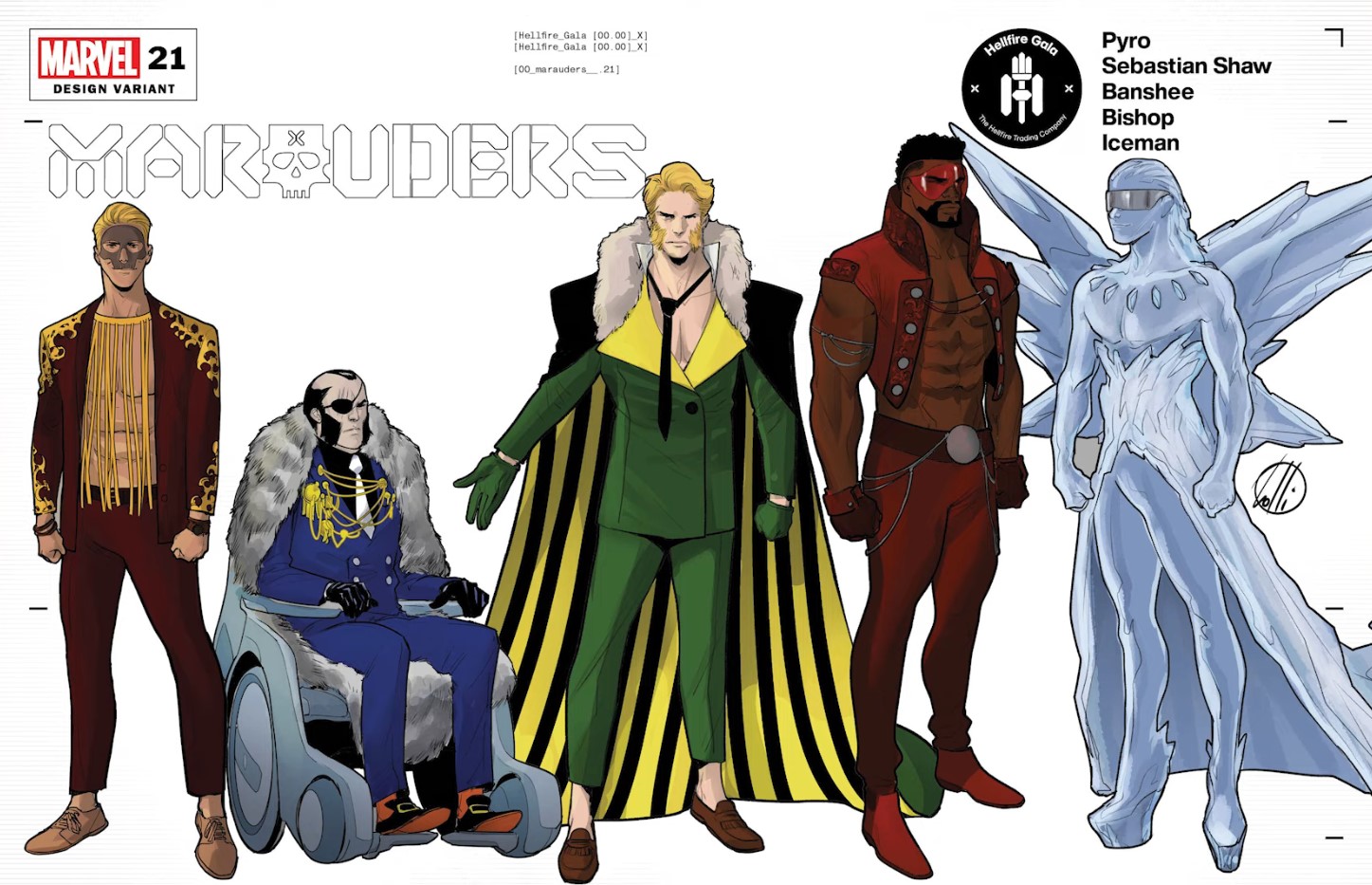
As far as Banshee’s outfit goes…meh. It’s pretty boring. It’s just a tailored version of his costume, so there’s really not much to say about it. I like his uniform , and I think it really works for him, but I wouldn’t go so far as to make it his Gala outfit too. It’s just overkill.
I don’t really understand the furry neckline on his cape and I dare say the outfit would be somewhat improved without it. The loosened necktie is a bit weird, but kind of flirty and quirky so I don’t totally mind it, and curiously enough I find that the highlight for me when looking at this outfit as whole is the loafers. Those stand out to me as the most unique element here, and everything else just pretty much feels like been-there, done-that recycled old Banshee to me.
Hands down my favorite designs here are Bishop and Pyro. I love how Bishop is really leaning into his Red Bishop role on the Hellfire Club, and I think he looks SUPER sexy in this outfit. It’s kind of a mix of like his tough guy routine, but with some dressed-up elements to it, like the embroidery on his vest and all those thin chains that are strewn across his body. I’m even into the sunglasses, although those are probably teetering on a bit goofy for me, but I think that overall he did a great job of matching simplicity with extravaganza, and the same can be said for Pyro.
I wouldn’t normally think that the all-fringe shirt would be a seller for me, but I think he pairs it really well with the simple Jacket and Pants. Both Pyro’s and Bishop’s looks share elements that I enjoy, like the subtle embroideries on their jackets, and I really enjoy how the embroidery on Pyro’s is reminiscent of flames licking at his body. Even his comb-swept hair is a nice, dressy touch here, and it’s fun seeing his edginess designed with a touch of class.
Sebastian Shaw’s look is pretty ho-hum. It’s nothing out of the ordinary for him, so I can’t really say too much. Of course he’d adorn his jacket with medals of valour highlighting his own accomplishments, that’s totally Sebastian Shaw of him, but because he dresses in a similar way any other day of the week, I don’t really feel one way or the other about this design.
Iceman on the other hand, I have a lot of feelings about. This is probably my least favourite design out of almost all the hellfire designs I’ve seen. I’m noticing a trend where the creators are dressing the queer male characters in dresses, and as a gay man myself, I actually think that’s a bit problematic. It’s like Iceman is being characterized not by his personality but by his sexual representation, and I don’t think that’s ok.
I think his design really edges on stereotypical, and if I could see Iceman in it then I’d be fine, but all I see is someone wearing something that’s meant to be marketed to the queer audience, and I think it does his character a total disservice. I don’t see Bobby wearing heels or a dress like this. Sinister maybe, or even Exodus, but it just feels way out of character for Iceman. And again – these wings? Like, am I missing something here?! Why are a lot of the queer male characters getting wings? This better not be some low-key way of calling them fairies, cuz I am not down with that.
The best part of his design is Bobby’s expression, because I can tell that he’s just keeping it cool. In that respect, I can see him wearing this as a ‘playful’ thing to wear. That’s more aligned with Bobby’s personality, and if that’s why he chose it, then I get it. He’s experimenting with his sexuality, so why not go a little ham. It’s definitely not what I would have chosen him to wear, and I do think that it’s a lazy surface-skimming representation of who he is, but at least he’s having fun.
5. New Mutants
The New Mutants are another team that don’t really have a “cohesive look” as a team, but I think they are all so outrageous that that might have been what they were going for. They’re all really bold and stand out, and it is a team of a lot of big personalities, so it makes sense that they’d all sorta compete for the spotlight in their own unique ways.
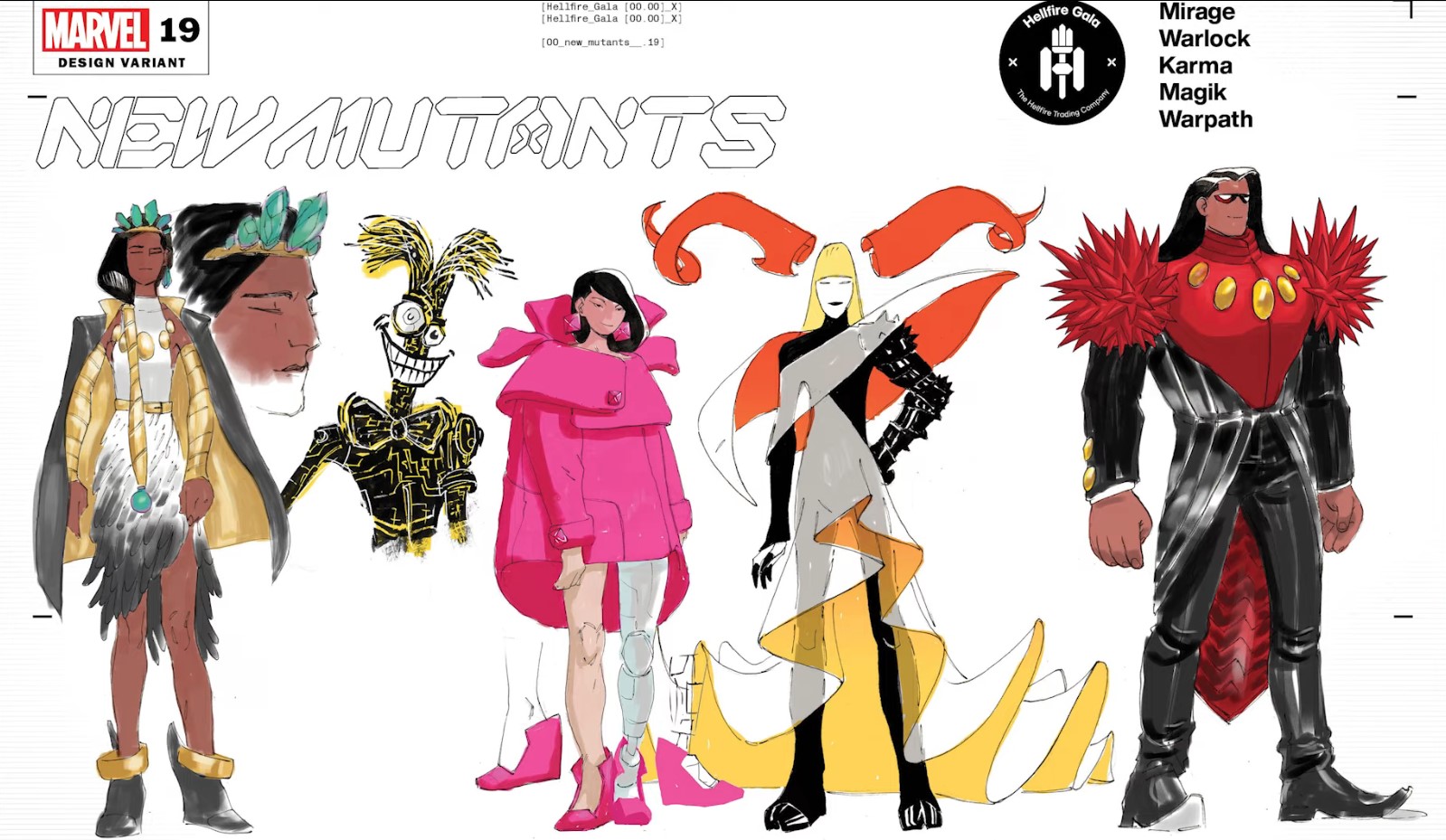
I think my fav out of this line-up is Danielle Moonstar. Something about her’s just feels really regal and correct, and I love her, like, mixed-media dress. It looks like there’s some plumage there, with the bottom half being comprised of feathers, and then the top-half is just like a standard fabric of some sort. I think it will look really cool in the final design, and I really like the crown. I’m not sure what gem that is, maybe an emerald or a larimar, but whatever it is, it looks awesome on her, and paired with the armor on her arms and in her braid she really looks like Valkyrie royalty.
And honestly, all the others look cool as well. Magik has some inferno-based color palette happening here, with a dress that I imagine is going to be floating freely around her. I’m curious about what those horns are going to made of, and if it will be fire or some sort of arcane ribbon-magic?
Warpath is a bit of a football-player meets blowfish with those shoulder pads, but they aren’t so crazy as for me to hate them, especially not because I feel like the rest of the outfit is unique enough so that the pads don’t stand out in a sore-thumb sort of way. I like how his jacket is cut in a penguin-y length, and his big broad chest is really accentuated with that pop of red.
I’m not really crazy about Karma’s big puffy jacket-dress here. The hood is definitely meant to echo the physical manifestation of her possession powers, but I don’t think it does it as sleekly or effortlessly as some of the Fan Art designs did. I really enjoy when clothes play with proportions, but something about this still feels incomplete to me, and maybe it needs to visit some other color to help break up the overwhelming pink just a tad.
And then Warlock. I mean sure, why not. It looks like he just got ready for a school yearbook photo, and while I am sure he could do much, much better than this with a little effort, it’s a cute little nod at his childish disposition, so I don’t mind it.
4. X-Corp
If these team displays really are announcements of who will be joining the cast, then suddenly I am all-in on X-Corp. Selene and Sunspot are both business tycoons, and I love the idea of them joining this book! Selene has been busy in the human world abusing her role in the Power Elite, so I am sure that she’ll have lots of juicy intel to give Angel & M as they work the human board room scene, and Bobby has been known to just outright purchase any corporation that gets in his way, so with this wealth and power in the X-Corps back pocket, suddenly nothing looks like it can get in their way.
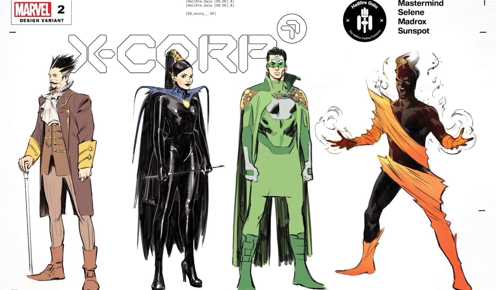
Selene is probably the highlight for me here, just because it’s so very, very High Priestess BDSM that I can’t stop looking at it. It’s like she’s taken her Black Queen attire to a fetish shop and has somehow levelled up her already-kinky wardrobe. Very happy to see the crop make a grand re-appearance as well, and that high pony is just reaching to the goddess herself.
I really like Mastermind’s outfit overall because I think it’s really clean and well-tailored, but I’m a bit disappointed because it looks like something we’ve already seen him in. It reminds me of his time spent in the Hellfire Club manipulating Jean Grey / Phoenix into becoming the Black Queen. I know that was just an illusion, and granted this outfit is probably just another illusion too, but I can’t help but feel like it’s an uninspired repeat of something he’s already worn, and I would’ve loved to have seen this but with a fresher spin.
Madrox’s is really cool, but it’s a bit like…superhero-y. Which is ironic that I’m critiquing it like that, because all of these people are super in their way, but his outfit is the only one that really FEELS that way to me. I like it, and I like the color, and I think the elements that he’s wearing all go together really nicely, but something about it feels like it’s a character from the DC or Malibu universe paying the X-Men a visit.
And as far as Sunspot is concerned, well…I’m really excited to see what this looks like on the pages. I think Roberto is a super sexy character, so seeing him so willingly exposed is really fun for me, but I also really like the way the little fabric that he is wearing is shaped around his body. It’s not like they are just hanging loose or are draped over him. They have a very fiery, molten feel to them, and even though the folds look like they might have been starched into submission in order to get that shape, I still get the sense there’s something flowy and not quite so rigid about this outfit as it may first appear.
I mean yeah, it’s a bit plain if you really just boil it down – it’s a piece of fabric that’s been cut up and strewn across his body – but I think it’s unique even to keep me interested and contrasts well against his crackling solar body!
3. SWORD
I think all of these SWORD outfits look really great. I’m really hoping that some Arakko mutants crash the Hellfire Gala party, because ever since X of Swords ended we really haven’t seen any of them do anything, so watching Khora debut and now attend the Hellfire Gala reminds me that they still exist and reignites my interest in learning more about them. Especially poor Redroot!
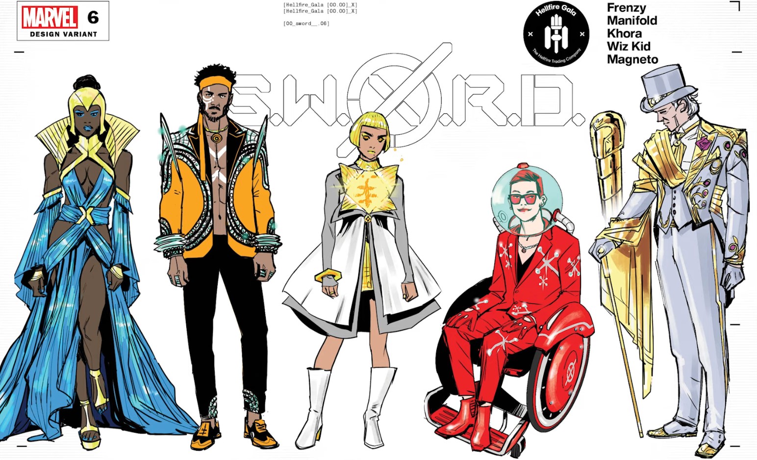
Khora’s outfit actually makes me think of something Sia the singer might wear. It’s probably just the haircut and the puffy mini-dress. I am sure Sia wore one like it before, but Sia-ness aside, I think it’s all really cute regardless. We don’t know a lot about this character yet, so it’s hard for me to do a any sport of deep-dive into its representativeness of her, but as a stand-alone garment I think it’s fun, and I love how it plays with layers and more importantly, peeling those layers away.
Manifold looks like a total hunk in this jacket. Honestly, to all the men out there, a jacket over an exposed chest is just a winning look overall, and I don’t think any character can go wrong with it. Manifold’s design is another example of a look that tells me about him without beating me over the head about it. His teleportation circles are a prominent motif, and it looks like he’s sparkling with some sort of rhinestone-encrustment which I suppose might be to harken to the way that he bends time and space.
Whiz Kid’s is a lot of fun. This is a guy that’s just here to be cool and quirky in his own unique way. I like that he’s not trying to make a statement, nor that he’s all like ‘look at me, look at how quirky I am’. I literally get the sense that he just put all of this together because it gave him a chuckle and he could care less about what others praise or critique might be. Whiz Kid is a character that can really stand out with this book, especially if they really play up his cool calm confident self-assuredness, just like how he’s wearing this outfit. I think he could be what Marvel wanted Quentin Quire to be, but without the annoying pompousness.
Magneto’s outfit is bordering on too much, but I really do enjoy it just the way it is, and I don’t think I would change a thing. It’s the color scheme that really sells it for me. I love the gold and the white or silver or grey, whatever it is, and I think the color-pops of fuchsia are just the right level of whimsy on an already fairly whimsical outfit. The gold looks so metallic, and knowing him, they probably really are solid gold filaments. He’s not one to dress in anything that he can’t weaponize in a pinch, so in effect he just looks like a really regal, powerful, well-dressed weapon.
But I think Frenzy is probably the stand-out here for me. I like all the looks, but Joanna’s just feels so sexy and powerful! I love everything about it – the helmet, and the color, and the way the fabrics criss-cross at the belt and flow down around her. In all honesty, I can’t say that I feel as though it represents “her” in any way, but I do see Amazon warrior. I’m not really seeing a lot of Frenzy here from any of her past allegiances, but that might be just what this look is for. Frenzy has a really great opportunity in this book to finally become a standout character. She was given a few shots in some other titles while she was living on Utopia, but she never really shone the way she did during the Age of X storyline, and I feel like giving her a lead role in SWORD is Marvel’s way of pushing her to the forefront. I am all about a Frenzy re-invention, and what a dress to debut your “new’ self in
2. Hellions
I’m super sad that we don’t get to see any of the official Hellions in this reveal. I was dying to see what Nanny & Orphan Maker were going to wear, but alas, it appears as though they are not on the guest list for the event. I think every design in this Hellions line-up works really well for the characters, but my one critique is that some of them just look like they’re wearing slightly tailored versions of their costumes. If I’m going to hark on Banshee for that, then I can’t let Sinister or Exodus get away with it either.
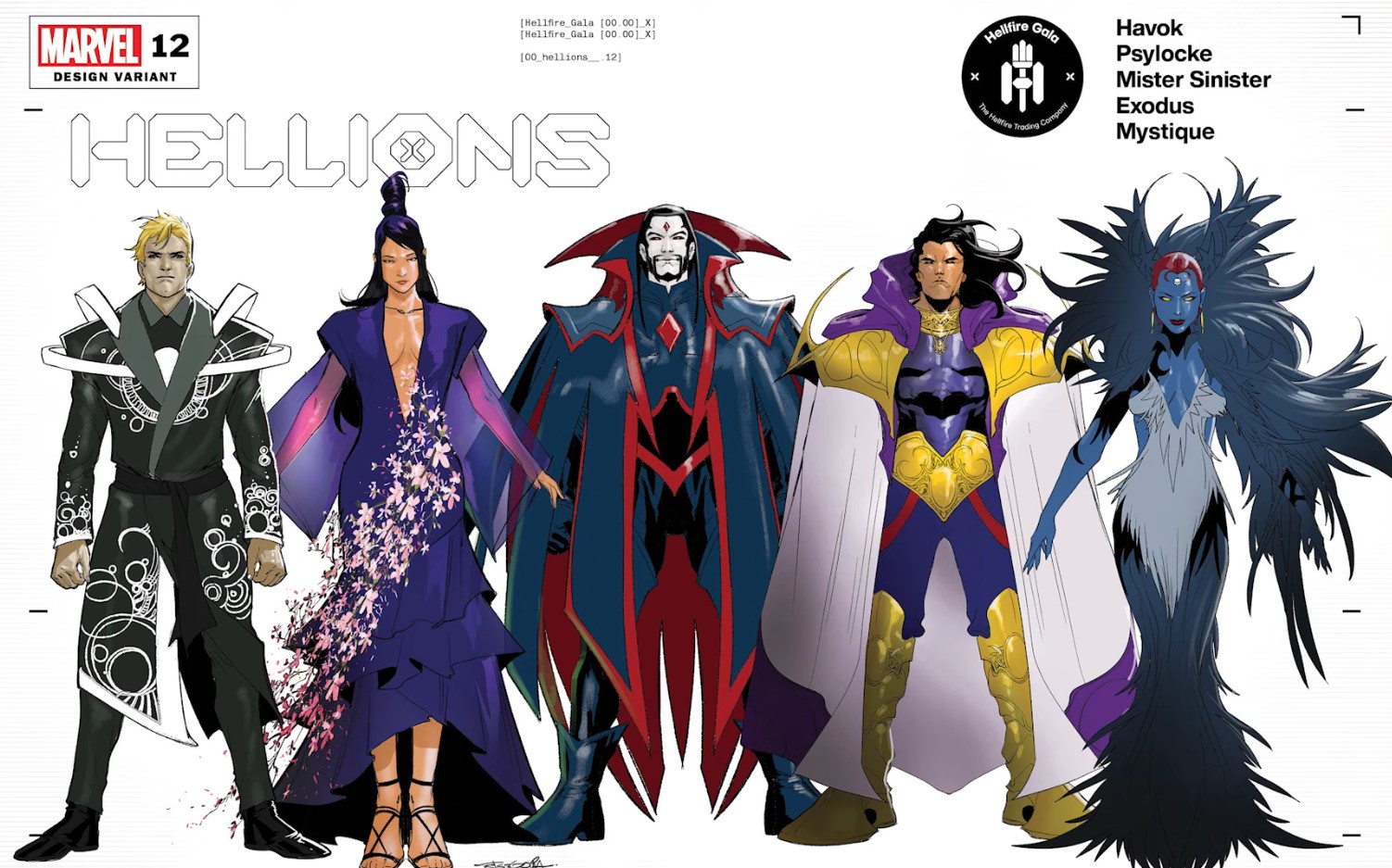
In all honesty, I kind of wanted a little bit more from Exodus. I do like this look, and I think he looks super powerful in it, but I mean…show us some range! This is literally just a bigger cape around his typical Acolyte wear, with the most interesting part of his costume removed in the first place – the gold statement piece on his back! I can see how he upped the level of sophistication in his armour here, and I think it looks appropriate for the Hellfire Gala, but I do wish that he went with something a little bit more off-kelter than what we’ve already seen him in.
And the same goes for Sinister. He’s been obsessed with his cape in recent Hellions issues, so it’s no surprise that they’d drag that joke on for this Gala by giving him a supersized version of his cape, but I just wish that he went with a different design. It’s not starkly unique enough from what he usually wears to really merit this being an accolade, and that’s a missed opportunity, because the way Sinister has been characterized in recent years as being all about camp and tongue-in-cheeked-ness, it really lends himself to going all out for this event.
I do like both Sinister’s and Exodus’ outfits, so I’m not knocking these designs at all, but I just think they could’ve tried something a little different.
I think my favorite of all these designs is Mystique. This is a silhouette we have not yet seen on her, and it’s kind of what I mean when I say it’s fun to see something different. It reminds me of an old action figure of hers where you could transform her into a monster by attaching monster pieces to her body. The way that fur is framing her head just gives a feral-ness to her, and I think that we are supposed to get the impression of her being wild just by the way the whole gown is kind of combed-outwardly.
I think the dress is super sexy, and even though it’s nothing we’ve seen on her before, I can still see a lot of Mystique in it, and one of my favorite parts of it is her slicked back hair. Just like how Emma’s slicked-back hair in her fringe look really pulls that all together for me on her, I think this slicked-back ‘do contrasts well with the wildness of the rest of her gown.
I think both Psylocke and Havok also look great. Of the two, I think Psylocke looks better than Havok. I really enjoy those sheer baggy sleeves, and I think there’s something elegant and simple in how the dress is designed. Psylocke is an overly-sexualized character, even though I wouldn’t say that it fits her personality these days, especially not Kwannon’s, so seeing her in something that is still sexy but a lot more modest actually feels way more on brand than her usual superhero costume. I’m not convinced about that garden of cherry blossoms that seems to be attached to her dress – it feels like it will just stick out and get in the way – but overall it’s very nice.
And then as for Havok – is this a robe? Because that’s kind of what I am getting out of it. The plasma discharge design veers on being too much here, but I think they stopped it before it go to that level. My favorite parts are the Black Sash Belt and the white shoulder huggers. It’s about time a male superhero got himself a sash belt, and even though those white bands around his shoulders look flimsy and as though they are made out of paper, they are the one element of this look that save it from just being another boring silhouette, and I think they save it in a big way.
1. X-Men
Hands down the best assortment of designs is on this X-Mean team reveal. Almost every single one of these designs is a total home run. Seeing this lineup under the X-Men moniker makes me feel as though there’s a chance that these reveals are actually not indicative of who will be on the teams post-Hellfire Gala, because as Marvel has already revealed, neither Colossus nor Cannonball are slated to be on the new X-Men team, but….who knows. It all could just be a red herring, or these characters could join after issue # 1, it’s all just speculation.
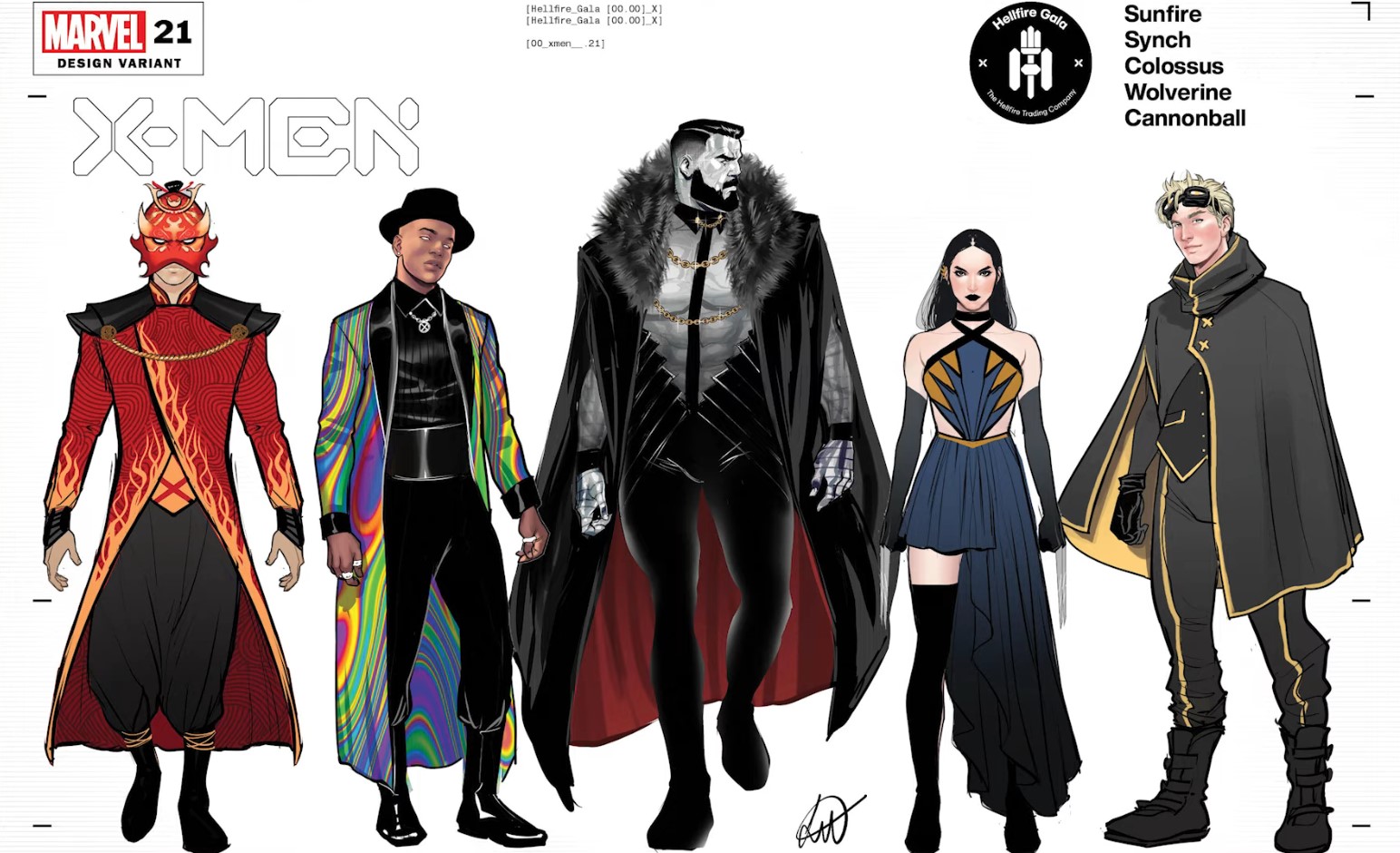
The world has been thirsting after Colossus in this outfit, and it is no wonder why. He looks absolutely magnificent here. This is truly something that we’ve never seen Colossus in before, but it’s also not totally removed from who Colossus is as a character, specifically with that fur which I believe is there to harken to his Russian roots. The sheer shirt with the gold chains and that very interesting cape is all truly quite breathtaking. Even his facial hair and hair cut are not to be messed with here! I don’t expect high quality fashion moments from Farmer Boy Piotr, but he really nailed it this time.
Synch looks really, really cool in his design. Like literally like a cool dude who you want to hang out with, but he might be too cool to be seen with you. I love that wide belt and how everything is black on black on black, except for his huge multicolored trench coat that’s meant to mimic his aura powers. Even without the jacket, though, I think that everything underneath just looks super sleek and well-put together. And that hat! Synch is definitely one of the most fashionable of all the designs presented, and it kind of reminds me of the Witches from American Horror Story Coven.
Cannonball’s outfit is also fantastic, and I dare say (much like Peter) this is the best he’s ever looked. It amazes me what these farm boys are turning out for the Gala. This cape and suit combo is everything. It looks so good on him, and it’s a uniquely fashionable moment that still borderline crosses over into superhero costume territory. But whereas Madrox’s looked a bit too out-there to be really in mode, Cannonball’s looks like he’ll be eating dinner first and then saving the day after dessert.
I think Laura’s outfit looks nice, but I’ll be honest, it isn’t one of my favorites, especially not stacked up against all of these other ones. Something about it feels unfinished. I know I’ve said that a few times, but I think it’s missing some sort of color, or something around the sleeves. I love an asymmetrical cut in a dress, but I don’t know if it’s really working for this one. Something about the cut looks like it was done in a rush and without much intention, which – knowing Laura – maybe it was. She may very well just have sliced it up right before this photo was taken.
Maybe the hair just needs a little bit more body or something to it. I can’t say that I “see” Laura as someone who gets dressed up willingly, so in that respect I think everything that’s turning me off about her in this outfit is actually a good indicator of her characterization, but if we’re just talking straight-up fashionable moments here, then yeah , I do wish there was a little something extra juszed up somewhere here.
I think my overall favorite of all the designs is Sunfire. I gasped when I first saw it. I think it’s really breathtaking. The homages to his superhero costume are plain as day, primarily with the mask and the flame designs, but they look really glammed up. His shoulders are I think meant to be an homage to the rooftop tilings of Japan, or maybe like a modern day version of the shoulder pads that Samurais used to wear, but whichever it is, it screams Japan to me and I think that’s a really beautiful and elegant touch.
Japan is a huge source of Sunfire’s ego and pride, and so seeing his country reflected in his outfit this way makes a lot of sense and I’m happy they didn’t just go the easy route and slam an image of the flag across his chest. I think the fit of that jacket is so nice, how it goes in at the waist and then slightly flows out by legs, and then the bagginess of the pants just to offset how tailored everything else is! All-in-all, a really really well-executed look!
Well that’s it! I’m really happy that Marvel went in on the fashion-side of the gala and has been feeding us with reveal drops like this. It’s been a lot fun.
Related Post
[the-post-grid id=”2459″ title=”Hellfire Gala Outfits 2021 X-Men Ranked”]